

The grids available in a number of WTP applets (Quote Grid, Option Quote Cube, Spread Builder, etc.) are dynamic data reporting tools, completely configurable in both appearance and content type.
The rows and columns in a WTP grid can be customized as follows:
Display
Columns (applet based, consisting of launch button fields, quote fields,
alert fields, and user-defined fields)
Colors
(standard and alternating backgrounds, selection colors, highlight
colors, text colors, market changing colors, PNL colors, buy/sell
colors, filled order colors)
Fonts
(headers/body text, size)
Alignment
(horizontal/vertical)
Format
(fractional/numeric/ticks for individual cells)
Conditional
colors (based on expressions, conditions, and target values)
Line
Style (none, solid, dashed, dotted)
Highlight period of a column (in seconds)
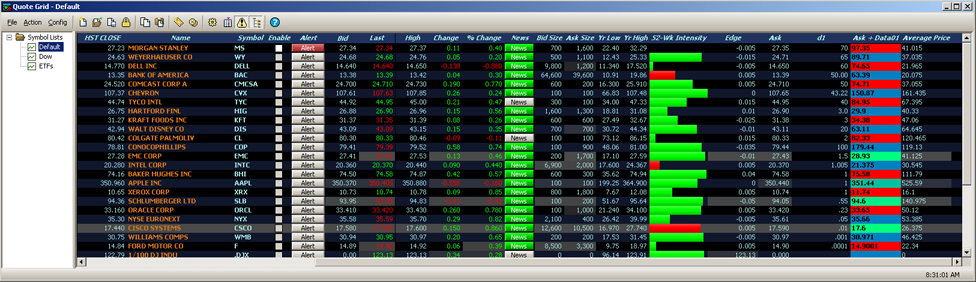
Quote Grid, default grid colors
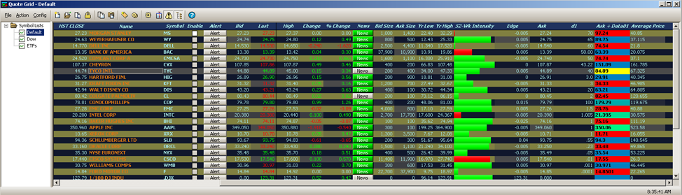
Quote Grid, custom row colors
Access the Configuration Screen
For most WTP applets, grid customizing begins with the Configuration screen:
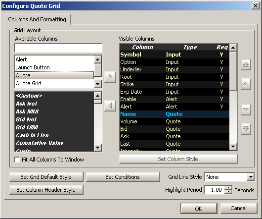
Right-click anywhere in the grid of an applet and select Configuration. A screen similar to the one above will display.
Font, format, and colors can be defined as default values
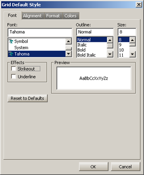
To define the default font for a grid:
Click Set Grid Default
Style
The Grid Default Style
window will appear and default to the Font tab
Choose a font, style, and
size. If the strikeout
or underline
feature is desired, check the appropriate box. The preview window
will display the font selections.
Press OK to accept the selections, or Cancel to exit the screen without saving.
For alignment related settings click
on the Alignment tab:
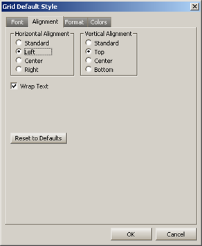
Horizontal and Vertical alignment are selected here. Both alignment settings refer to the positioning of content within a grid's cell.
Wrap Text causes text to automatically fit within a cell by causing the copy to break to the next line. If unchecked, text will not automatically break to the next line.
Decimal Places refer to the display of the amount of integers following the decimal point (example: setting the value to 5 will, if necessary, display up to five numerals after the decimal point).
Reset to Defaults sets formatting to WTP's original default values.
To select default Colors, click on the Colors tab:
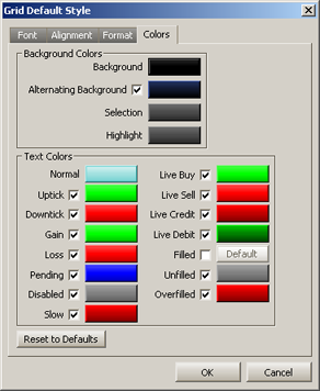
The color selection screen above may not match exactly depending on the WTP applet, but there are universal settings applicable to all color selections.
To change colors:
Click
on a color that is to be changed. The color window will open:
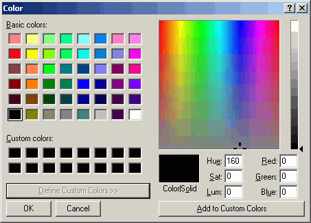
From this window you can:
Select
any color just by clicking on it
Create a custom color either manually (by entering numeric values), or by moving the mouse in the color field into an acceptable color is found.
When
a color is defined, click Add to Custom Colors and the new color
will be in the Custom colors portion of the window.
Click OK to accept your changes or Cancel to exit the color window without accepting changes.
The method for changing the Column Header style is identical to that of the Grid default style. Fonts, formatting, and colors are selected in the same manner. See Set Grid Default Style for directions.
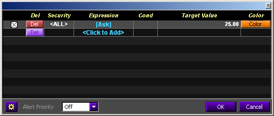
In this example, all securities with an ASK value less than $25.00
will be flagged in this color.
In addition to defining overall colors for the grid and headers, defined conditions (such as the asking price on a security that has decreased) can be flagged with a specific color.
To set up Row Color Conditions:
Select Set Row Color Conditions
from the Configuration window.
Select a specific security
(if available), or select <All>.
Click a field in the Expression
column and select an expression from the drop-down list. Expressions
include: Ask, Bid, Previous Close, and Last.
Select a condition ( < <= =
> >= Not =)
Enter a target value.
Press the Color button
Select OK to accept your values or Cancel to exit the Row Color Conditions window.
The rows in the grid will highlighted where the color condition matches the target value.
In addition to setting visually-based color conditions, an audio alert priority can be set up to play a sound when defined conditions have been met.
In
the Row Color Conditions window select an Alert Priority from
the drop-down list (Low, Medium, High).
Press
the Notifications Config button  and the
Global Configuration screen will display.
and the
Global Configuration screen will display.
In
the Event column are listed the three alert conditions. Click
once on the row containing the priority level selected in Step
1.
Select
a sound to be played when the conditions on the grid have been
met, by selecting a .wav file from the drop-down list.
Alternatively, you may browse for a .wav file anywhere on your
system by pressing the Browse button and select the appropriate
.wav file.
The selected .wav file can be sampled.
Press the play button  to hear the .wav file.
Column Data—Ascending, Descending, and Absolute Order
Every column in a grid can have its content displayed in ascending or descending order.
To change the display order of a column:
Double-click the mouse
on the head of a column who's data display is to change. The data
will be displayed ascending in value. (If the column contains
only text, the column will display in alphabetical order).
Double-click the mouse to toggle the display (from ascending to descending and vice versa).
Absolute Order
In addition to ascending or descending order, all numerical columns can be sorted in absolute order. An absolute sort follows this similar pattern: 0, -1 , 1, -2, 2, etc.
To sort a column in absolute order, double-click on the column head three times, OR right-click in a grid and select Sort Absolute Ascending or Sort Absolute Descending.
There are a three methods for adding columns to grids.
Method 1: The Configure Window
In a WTP grid app (Quote Grid, Order Grid, etc.) open the configuration window under the Columns and Formatting tab.
Select the field type (i.e., Alert Fields,
Launch Button Fields, etc. Note that field types are different for
different grids). Within each field type are the columns available
for placement in the grid. Double-click the column to be added or select the column to be added
and press the right arrow
button  . The column will be placed below
the row selected in the Visible Columns
portion of the window. Select OK
to save your changes. The column will then be visible in the grid.
. The column will be placed below
the row selected in the Visible Columns
portion of the window. Select OK
to save your changes. The column will then be visible in the grid.
See Field Chooser (below) for a more detailed explanation on how to search for column names and field types.
Method 2: Right-Click
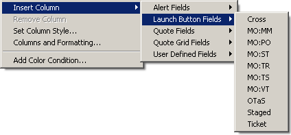
Right-click on any column head in the grid. Select Insert Column-->The Field Type-->The Column Name.
The column will be placed immediately to the left of the column that was originally selected.
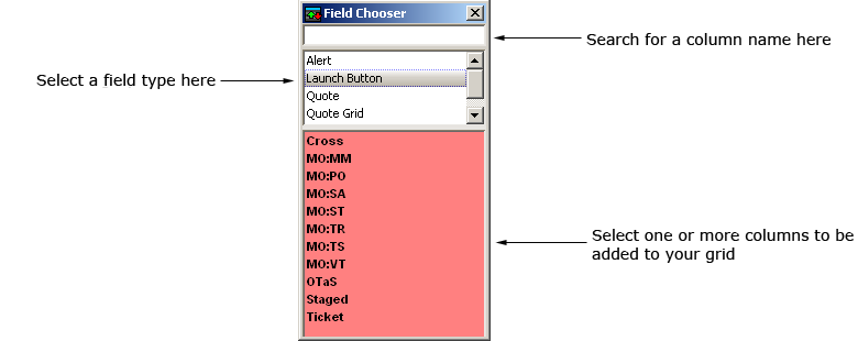
With Field Chooser, single or multiple columns can be inserted in all WTP grid apps in a manner that is relatively easy.
The benefit of using Field Chooser is that multiple columns can be added in a single pass, whereas only a single column at a time could be added via the Insert Column-->Field Name-->Column name command.
Launch Field Chooser
In a WTP grid app, right-click on any column head and select Field Chooser. The Field Chooser selection window opens.
Select Columns with Field Chooser
Search For Column Names:
In the top section of the Field Chooser window a search term can be entered. Field Chooser displays the column names that apply to the search as is it keyed.
For example, in the image above, entering the letter "s" will reveal only those column names that have the letter "s" in them. If you add the letter "t", columns containing an "s" and a "t" in that order will be revealed (i.e., MO:ST, Staged, not MO:TS).
Select a Field type:
In the middle section of the Field Chooser window (white background) select the field type (for example, Alert, Launch Button, etc.) Note that field types are specific to each grid.
Once a field type has been selected, the columns associated with that field type are displayed in the bottom portion of Field Chooser (the background color in Field Chooser reflects the background color of the grid).
Select one or more columns:
To place a single column to the left of the selected column, double-click on a column name.
To place a single column anywhere in the grid, single-click a column name and drag the column to the desired location in the grid and release.
To select and place multiple columns anywhere in the grid in a single pass, hold down the Ctrl key while selecting the columns. Drag the selected columns to the desired location in the grid and release.
When a column is placed in a grid it is removed from selection in Field Chooser. When a column in a grid is removed, it is available for selection in Field Chooser.
Select Fields in the Field Chooser via the Keyboard
Fields in the Field Chooser can be selected using the keyboard exclusively.
Use the Tab key to maneuver between the three sections of the Field Chooser. Once in the desired section, use the keyboard's up/down arrows to select a value. Press Enter to add the selected field(s) to the grid.
To select multiple adjacent fields, hold the Shift key down while pressing the up/down arrows.
Note: Multiple non-adjacent field selection with the keyboard alone is not supported. To accomplish this, select and hold the ctrl key and click on the desired fields with the mouse.
To move a single column:
1. Select the column to be moved with a single mouse click on the column head.
2. Press and hold the left-mouse button and move the column left or right.
3. Release the mouse button.
To move multiple adjacent columns:
1. Click and hold the left mouse button on the first column to be moved.
2. Moved the mouse left or right to select adjacent rows to be moved.
3. With all the rows selected, click on one and hold the left mouse button.
4. Move the entire group of the columns left or right as desired and release the mouse button.
An alternate method for selecting multiple columns:
1. Select a single column.
2. Move the mouse to the left-most or right-most column in the group of columns.
3. Hold down the shift key and click the left mouse button. All columns will be highlighted.
1. Right-click on the column head for the column that is to be deleted.
2. Select Remove Column.
Multiple columns can also be deleted by this method. See Move Columns (above) for directions on selecting multiple columns.
To add a row to a grid:
Click on a row where the
row will be added.
Press Insert on the keyboard.
The row will be added above the selected row.
To delete a row in a grid:
Select a row that is to
be deleted.
Press the Delete key.
The row will be deleted. A deleted row cannot be undeleted.
Most grids in WTP allow the placing of orders by bringing up the Order Ticket.
Double-click the mouse
on a row containing a symbol that is to be traded.
The Order Ticket will appear.
A quote field column that can be added to grids is initially identified as <Custom>. The data in a custom column is supplied by a custom field ID. Once a field ID has been defined for a custom column, the column's name automatically changes to match the description of the field ID. For example, a field ID of 5 = Ask. The column's header will default to the standard FID Acronym (though, as with all column heads, it can be customized).
Step 1: Add a Custom Quote Field
Click the configuration
button  .
.
Alternate
Methods:
Right-click on any existing column head and select Field Chooser --> Quote --> <Custom>.
Right-click on any existing column head and select Insert
Column --> Quote Fields --> <Custom>.
Select Quote.
Select <Custom>.
A new column <Custom> will be placed in the grid.
Step 2: Set the Column Style
Right-click
on the column header <Custom>
in the grid and select Set Column
Style. The <Custom>
Style window opens:
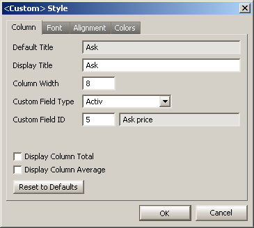
Select
a Custom Field Type:
•
Activ
•
Solace (Numeric)
•
Solace (Text)
Enter an FID number in
the Custom
Field ID field. If the number is an active FID, the
<Custom> Style window
will respond by populating the Default
Title, Display Title, and Field
ID Name fields.
Click OK to save the defined custom style. The custom quote field column will be placed in the grid with its title displayed.
User Defined Fields are grid columns also known as Expression Fields (or Calculated Fields). Similar to the cells in an Excel spreadsheet, functions can be created for columns that yield a text or mathematical result.
Expression Fields
There are two types of Expression Fields:
Numeric
(Used for displaying Expressions that return numerical values.
Addition/subtraction/multiplication/division functions can be
used in numeric expressions. )
String (Returns string values)
Define Expression Fields
From the applet's configuration screen,
select User Defined Fields.
Select either <Numeric
Expression> or <String
Expression> and press the right-arrow key to add it
to the grid.
In the grid, right-click on the column
head and select Set Column Style.
One of the following will open, depending on the expression:
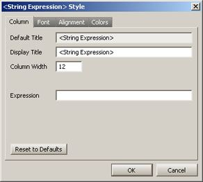
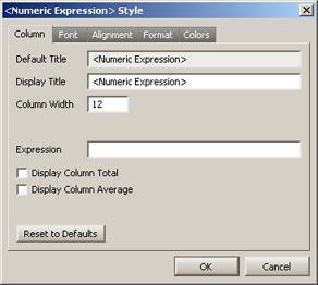
<String
Expression> Style <Numeric
Expression> Style
Enter a Display
Title in the Display Title field. The title entered here
will be the column head title that is displayed in the grid. (The
Default Title field cannot
be edited.)
For String Expressions, optionally enter
a column width.
For Numeric Expressions, optionally enter a column width, and,
if desired, check whether the column will Display
Column Total and/or Display
Column Average.
Enter an Expression.
Click OK.
Data Fields
In addition to the Expression Fields, there are up to 16 Data Fields from which to choose. Data Fields are input fields where static information is applied to an Expression.
A Data Field can have its content entered directly in the grid, and have its content calculated in an expression (which references the Data Field's values). Data Fields have their names defaulted to DataXX (where XX is the Data Field number, 01 to 16). Once a specific Data Field is added to a grid, that Data Field is removed from the list of available columns.
Define a Data Field
From the applet's configuration screen,
select User Defined Fields.
Select an available DataXX
column and press the right-arrow key to add it to the grid.
In the grid, right-click on the column
head and select Set Column Style.
A Data Field Style window will open:
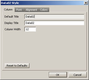
Enter a Display
Title. The title entered here will be the column head title
that is displayed in the grid.
Click OK.
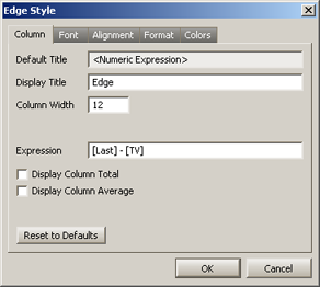
Numeric Expression Example
In the following Numeric Expression, the goal is to display the Edge value in the grid. The expression [Last] - [TV] will yield the Edge value.
The Style window contains the display title
and expression:
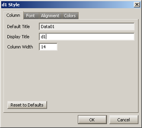
Data Field Example
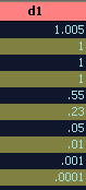
In this example, a Data Field (Data01) has been created with the name d1:
The d1 column in the grid shows text manually added:
String Expression Example
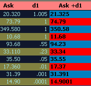
In this example, a string expression has been built around the manually created d1 (Data01) column (above). To this column is added the current Ask value for a security:
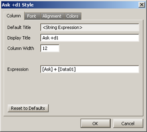
The new column, titled Ask + d1 takes the Ask value and adds it to the d1 value and displays the sum:
Advanced Functions
A variety of Advanced functions (math/string/logic/date + time) can be called in all WTP grids.
See available functions on the List of Functions page.
© 2015 Wolverine Execution Services, LLC